

House Envy: Old House, New House...What happens when California cool meets traditional Victorian terrace?
“Everything felt so cramped and squashed”, says Interior Designer Jenna Choate. Jenna grew up in the wide, open spaces of homes in Texas and later moved to the industrial cool, but still lofty spaces of New York. So when she and her partner moved to London and bought a traditional Victorian terrace in Finsbury Park, they undertook a massive renovation project to reconfigure the house in a way that worked for them. The results are a testament to what can be created with a little imagination and the willingness to push beyond the traditional “limits” of Victorian architecture. She says: “I love so many qualities about the history of the building but my design sensibilities are very American, I lived in New York for a very long time so that influenced my design aesthetic. The black grids, the big open spaces etc I’m also very inspired by the Cali cool style of light, airy but modern spaces. I just don’t understand why rooms are so little and skinny here!”

Stella basking in the sunshine
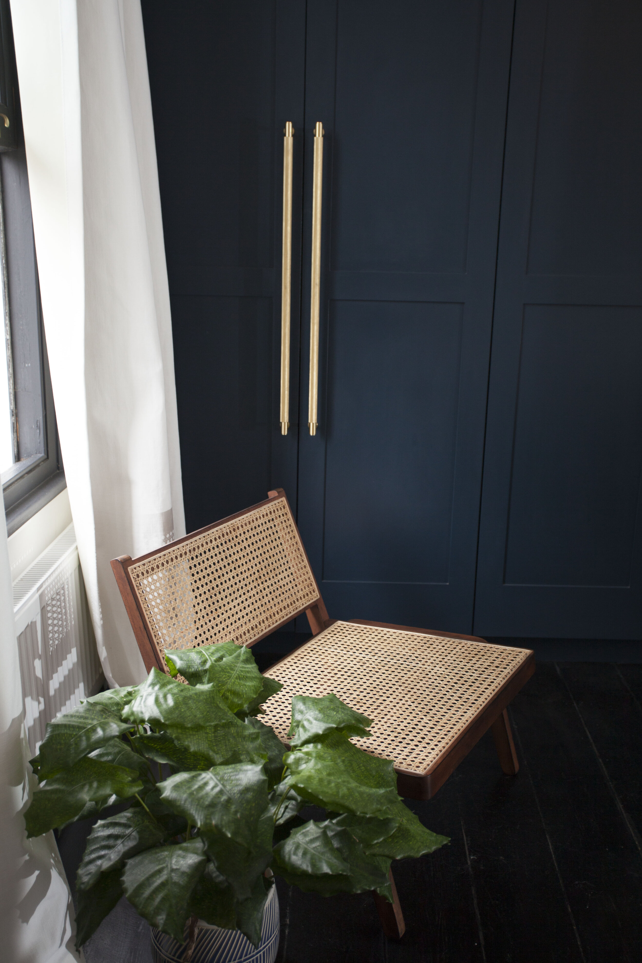
Jenna is one half of Interior Design duo Interior Fox, who I featured early on, on the blog back when they first launched their business, and I’ve loved watching their business grow to the point that last year they launched a collaboration with none other than H&M Home! So I’m very excited to now share Jenna’s beautiful home with you too. We’re starting the tour in the lounge, which is probably the most traditionally Victorian room in the house in terms of features. Jenna wants you to know this room is still “very much a work in progress”, but it looks beautiful to me. I love the bold black shutters and the side by side armchairs in the bay window. Next on her hitlist to tackle is the fireplace, she said: “The log burner kills me. It’s cute but the proportions just don’t make sense to me. I desperately want to get a vintage marble fireplace which will look much more grand.”

Moving on to the library, this is where we really start to see how Jenna changed the layout of the house. They worked with an architect to carve up the ground floor and create a mezzanine floor, which sits above the kitchen and another newly created snug area. I’ve included a drawing at the bottom of the blogpost so you can see how everything is laid out. This is the first room you come to when you enter the house and Jenna thinks it’s probably her favourite, she says: ”I’m obsessed with what I call my jellyfish lights, the pair of fringed pendants that hang over the mezzanine floor. They are by a Spanish brand called Fambuena.”

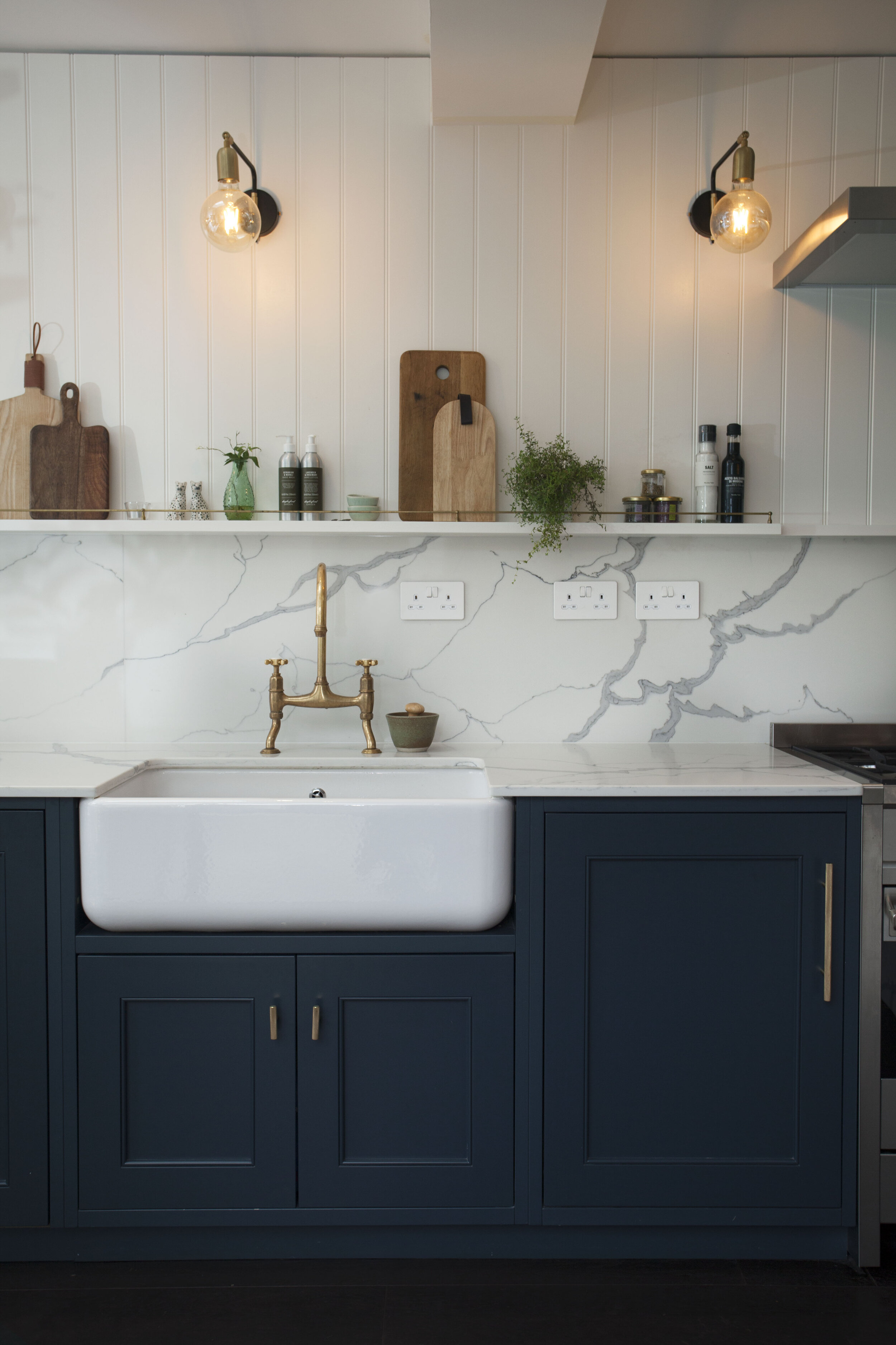
There are steps down from the mezzanine floor into the large kitchen diner. Jenna and her partner added an L shaped extension to the back of the house. There had previously been a tiny kitchen where the snug is now. They shopped around for kitchens but in the end got their carpenter to create a completely bespoke kitchen for them at a fraction of the price of the ones they had seen. The quartz worktop and splashback was sourced from a local stone yard. “ One of my top renovation tips would definitely be to get your carpenter to make things for you. It often works out wayyyy cheaper. I wanted to combine Shaker style cabinets with my modern glam style and our carpenter totally met the brief.”

Another of Jenna’s top renovation tips is about lead times, and it’s something I will definitely taking on board as we prepare for our own kitchen renovations. She said: “A lot of my decisions were based on lead times in the end. I had created this beautiful moodboard and I wanted to get these beautiful ornate tiles, but they took 6-8 weeks to order and things started happening really fast, much faster than I imagined they would. I ended up buying some things because I could get them quick.”
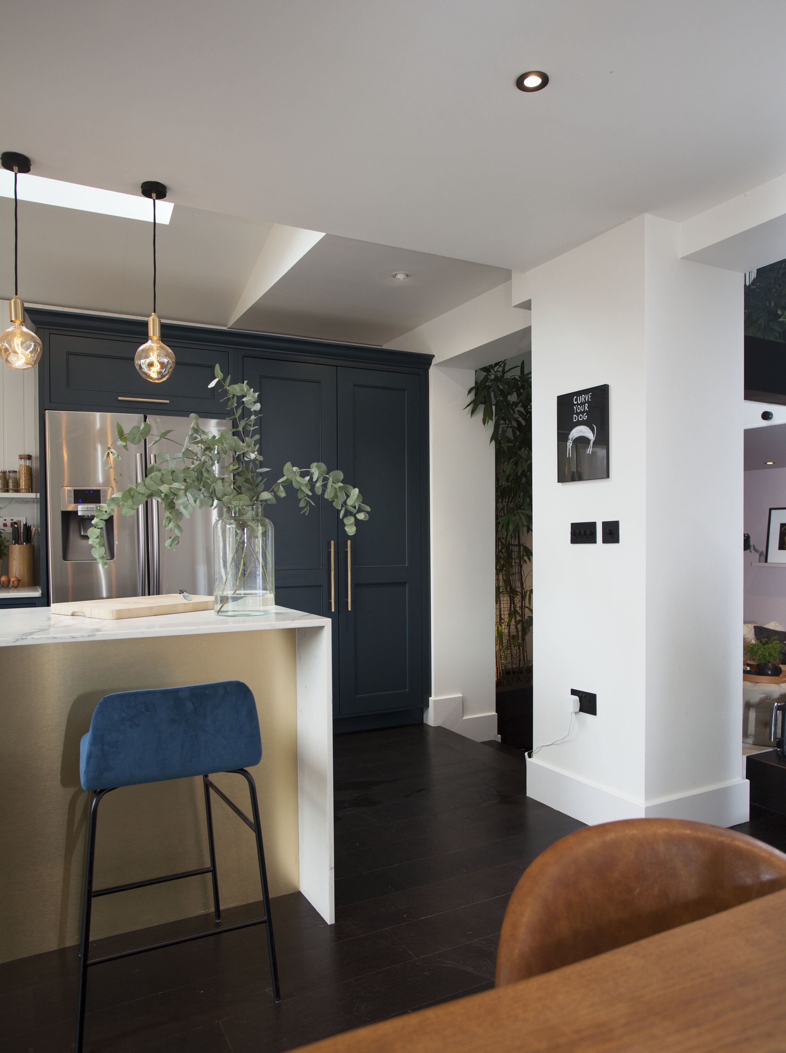
Next to the kitchen is a large spacious dining area and a very cute bar. You can also see one of the newest additions to the house, the back rest behind the dining table, newly upholstered in my fave Kelly Wearstler Graffito fabric.
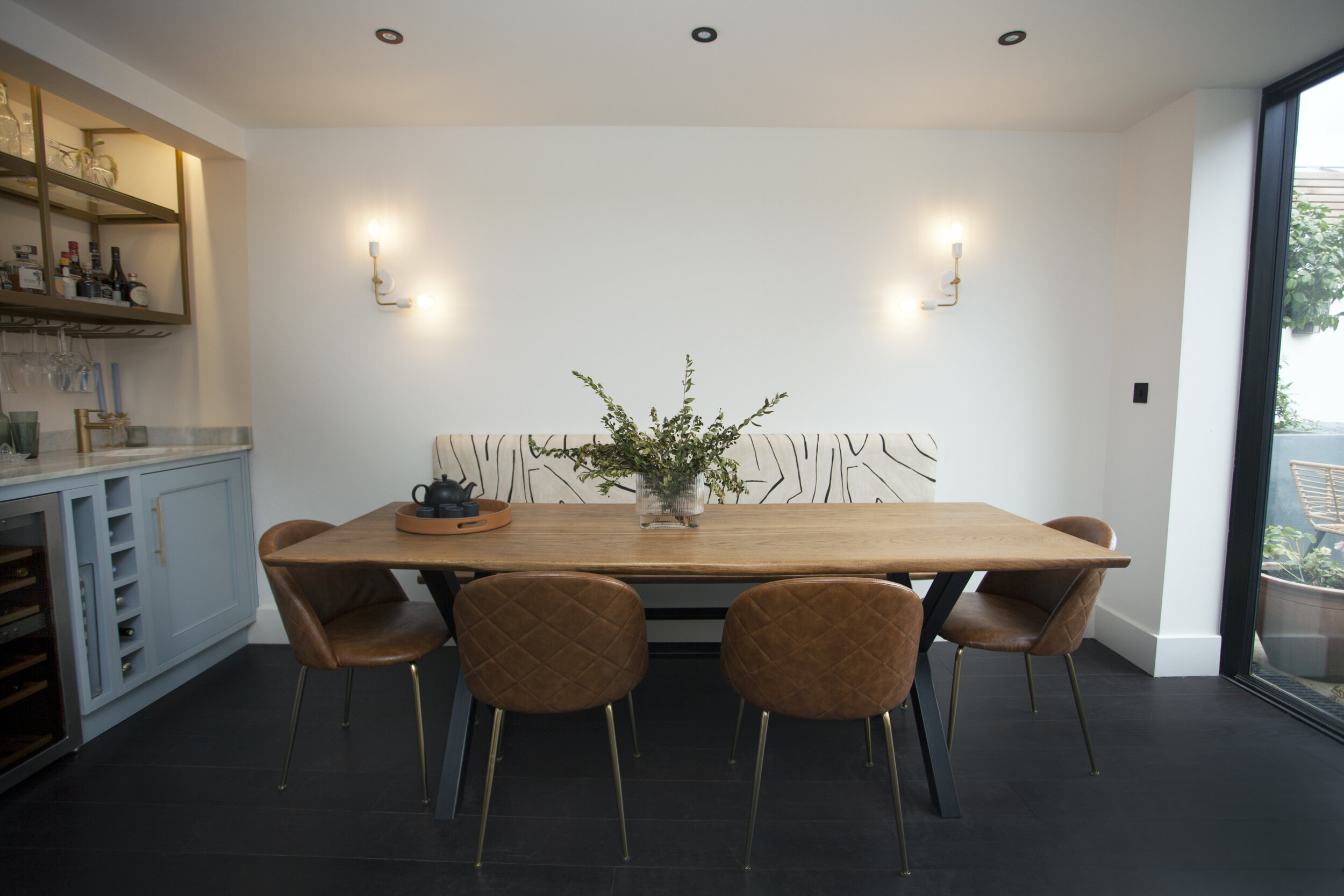
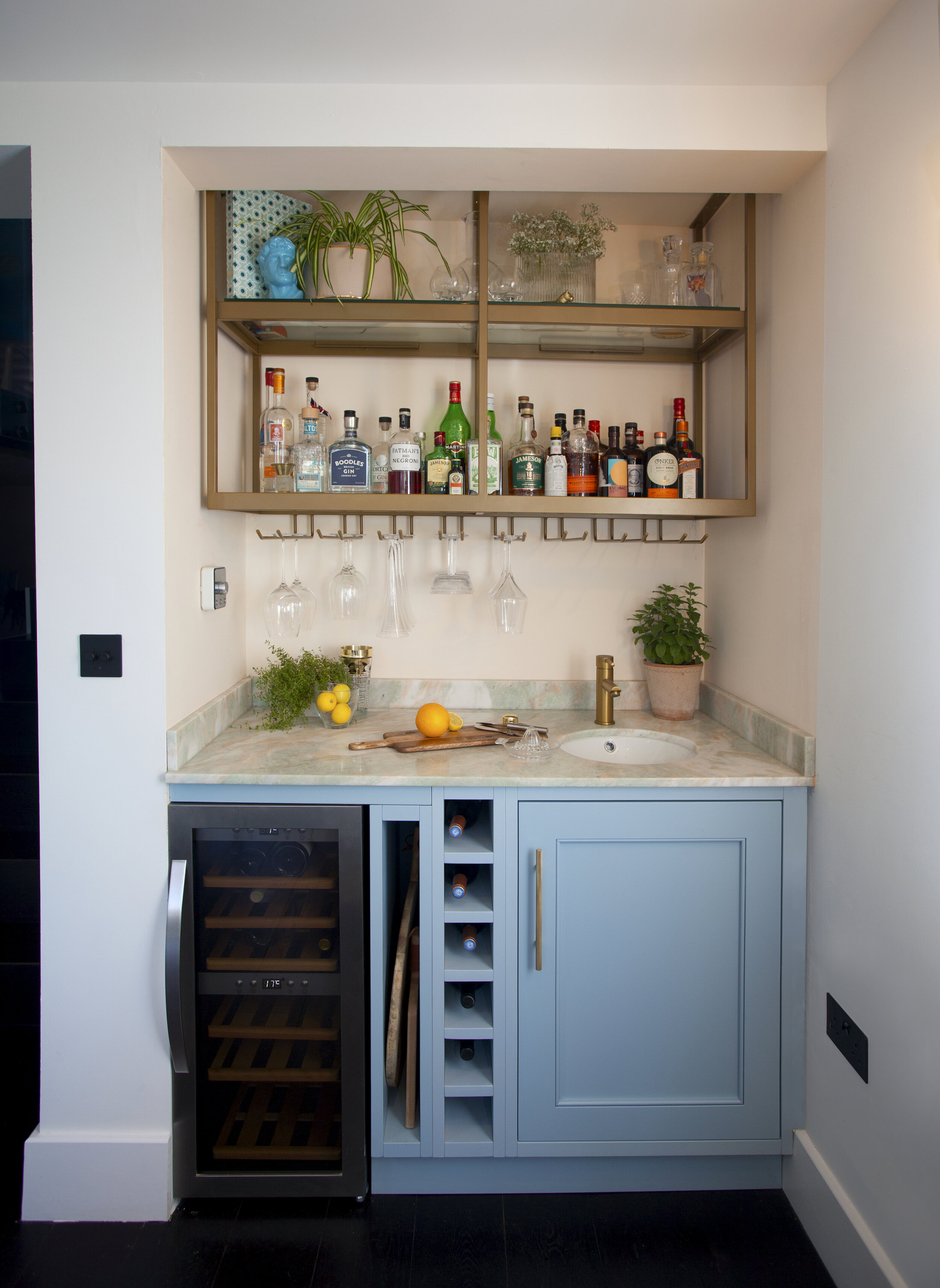
The bar was created to fit this nook and painted in Parma Grey by Farrow & Ball. Jenna then found an off-cut of amazing pink and green marble to top it off.
Next to the kitchen, and under the mezzanine floor, sits ‘the snug’, as you can see in the image below. This used to be the kitchen and Jenna wanted to create a laidback, chill vibe in here. She got the low level seating from Abigail Ahern, despite some of her family members not being entirely on board with the concept. “I love the floor cushions but my family was advising against them because they said it reminded them of a college dorm and no-one wants to sit like that! But I love sitting in there. They are really comfortable and sturdy at the same time.”

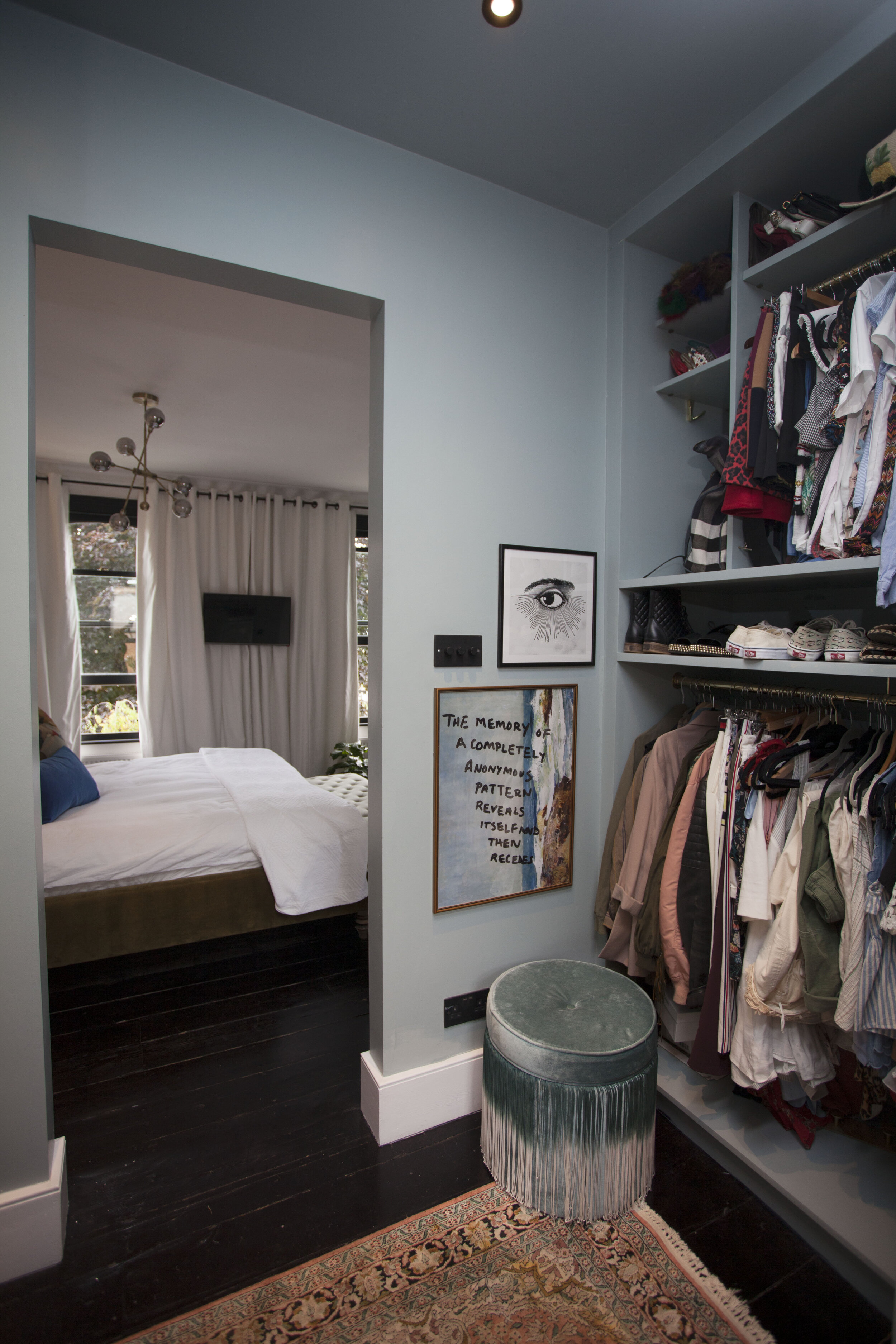
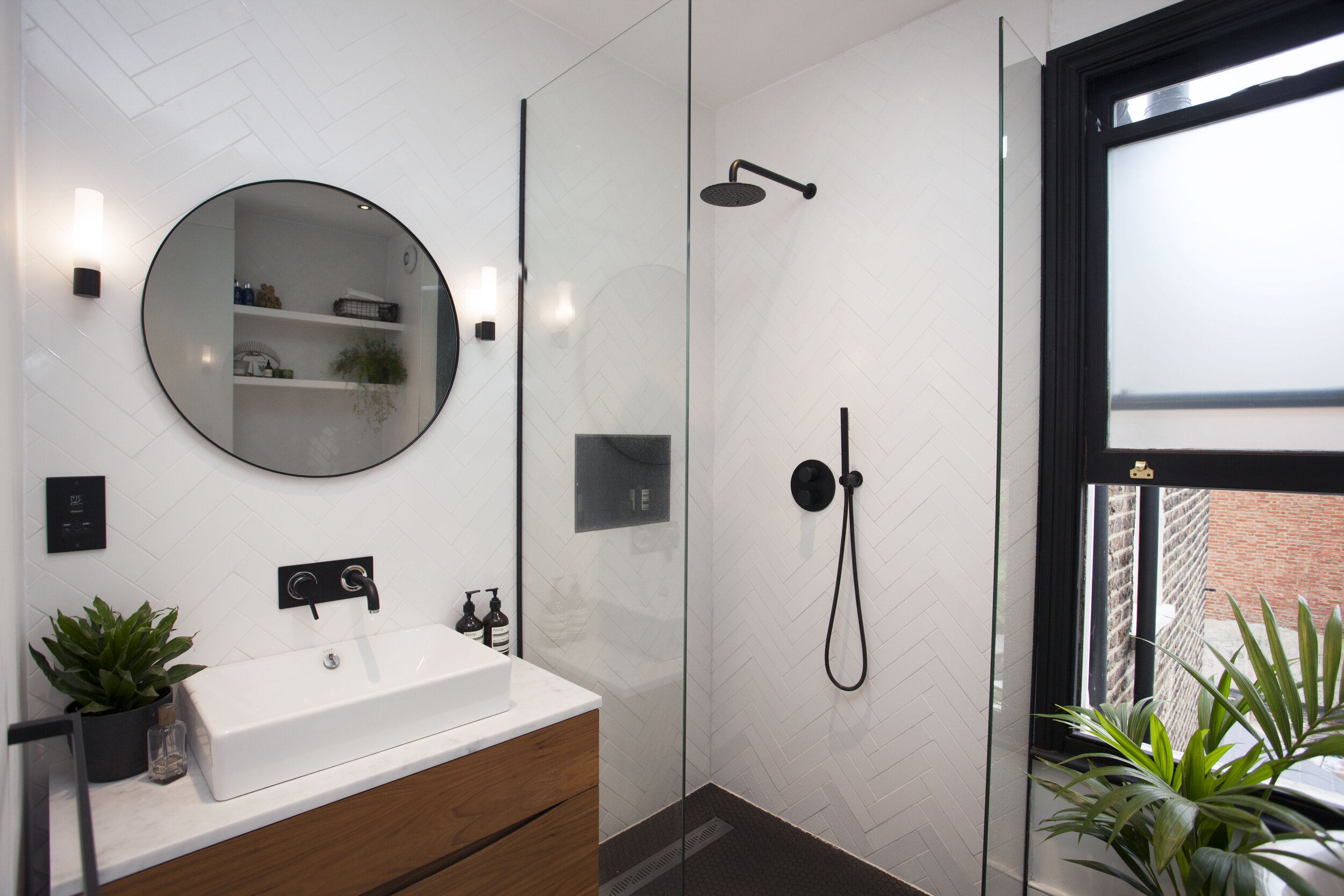
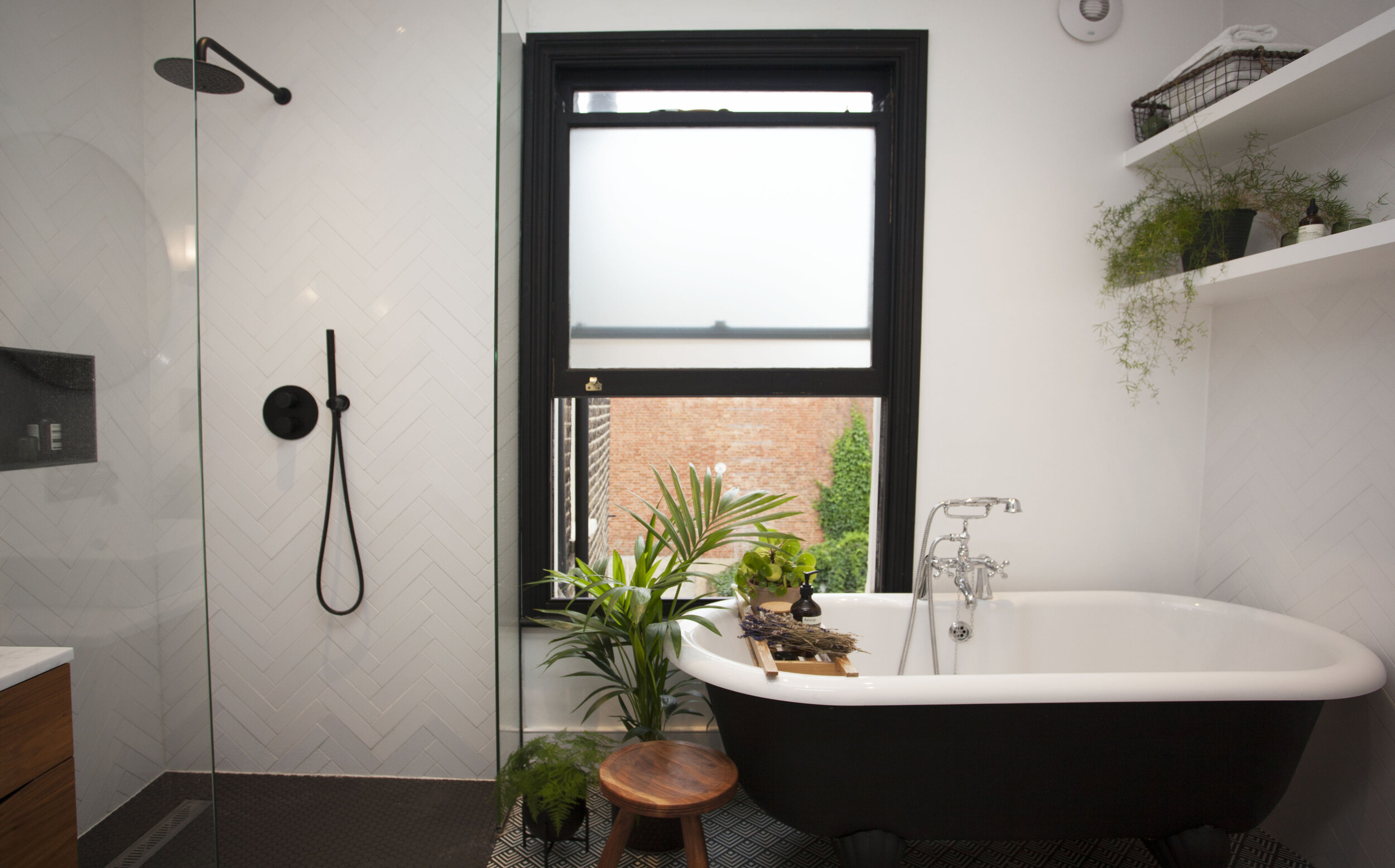
If we head back upstairs, we’ll start with the master bedroom. Jenna said: “When we bought the house there was a tiny bedroom next to this one, but we changed the layout so we could have a master bedroom with a walk in closet and bathroom. We closed off the door to the tiny room and opened up a wall within our bedroom to access the dressing room and bathroom we created.” A walk-in closet is the stuff of my dreams so I applaud them for this bit of clever planning. The gorgeous olive green bed is from Love Your Home and chair is H&M Home.


Despite being an Interior Designer, Jenna still found it challenging to manage and make decisions for her own project. She said: “It’s so much harder to do your own home, for sure. I know what I like and I’m really good at making decisions for a client scheme. But for my own house, I found it hard to hone in on exactly what I wanted and stick to it. I hate to be a trend driven person but I can’t help responding to the environment I work in and when you’re always seeing new things, it’s easy to get distracted. But I knew that I liked dark, almost black flooring, black on windows and white walls and wood is my neutral. Each room had it’s own aesthetic and gradually they all started to string together.”

Guest Bedroom
Another major challenge in the renovations was squeezing an extra bedroom into the basement. “When they bought the house, this room wasn’t a liveable space. It was basically used as a support for the house and as it was, there was no way we could fit a bed in there, but we knew we had to, so we had to get a structural engineer and architect to really work out how we could reconfigure the space without taking away the foundations. In the end, we created a simpler support system and then got a carpenter to do built ins around it to cover the supports up. So some of what you see isn’t actually usable as storage. For example, the entire window nook is built around the foundations which are holding the house up.”

Next we have the almost completed office space. I absolutely love the texture from the wooden batons which have been applied to one wall, and that Love Your Home loveseat is perfection. I say almost completed because Jenna will soon be adding some very cool Drop It Mod wallpaper to this space. If you haven’t heard of the brand, they are definitely worth checking out, but beware the import taxes! Jenna says: “ I think this is going to be my favourite room once the paper is up.” I can see why!

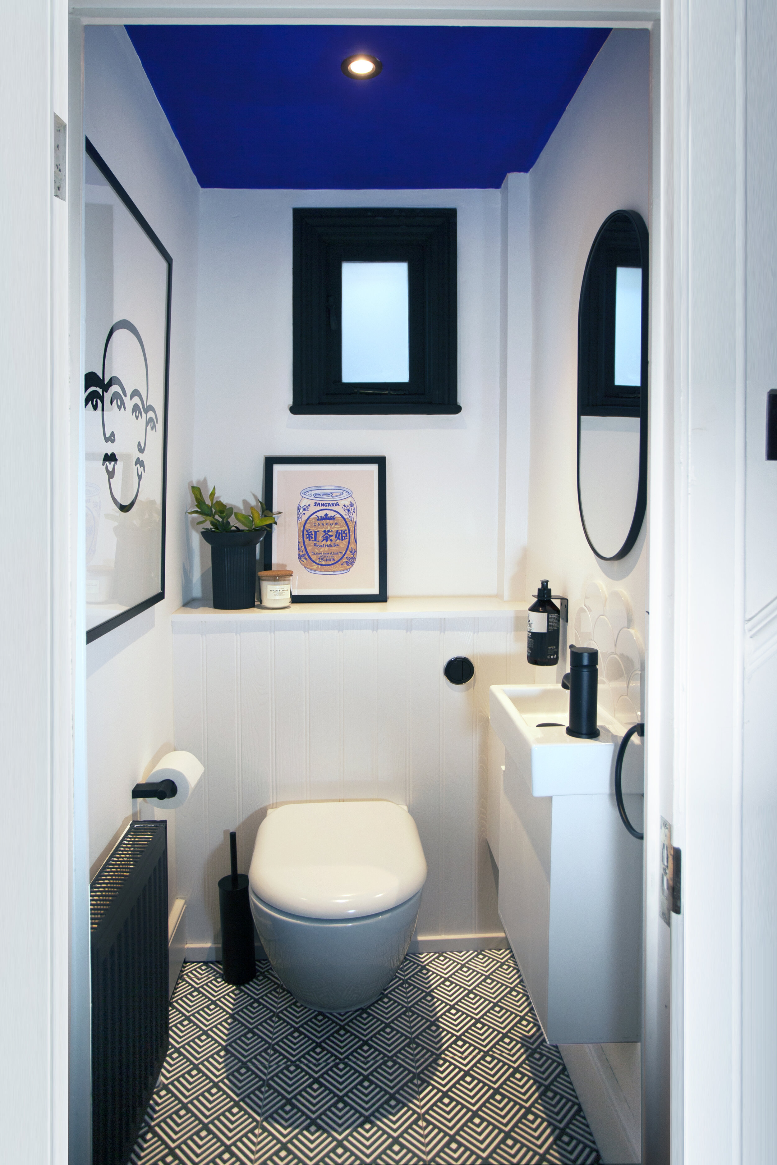
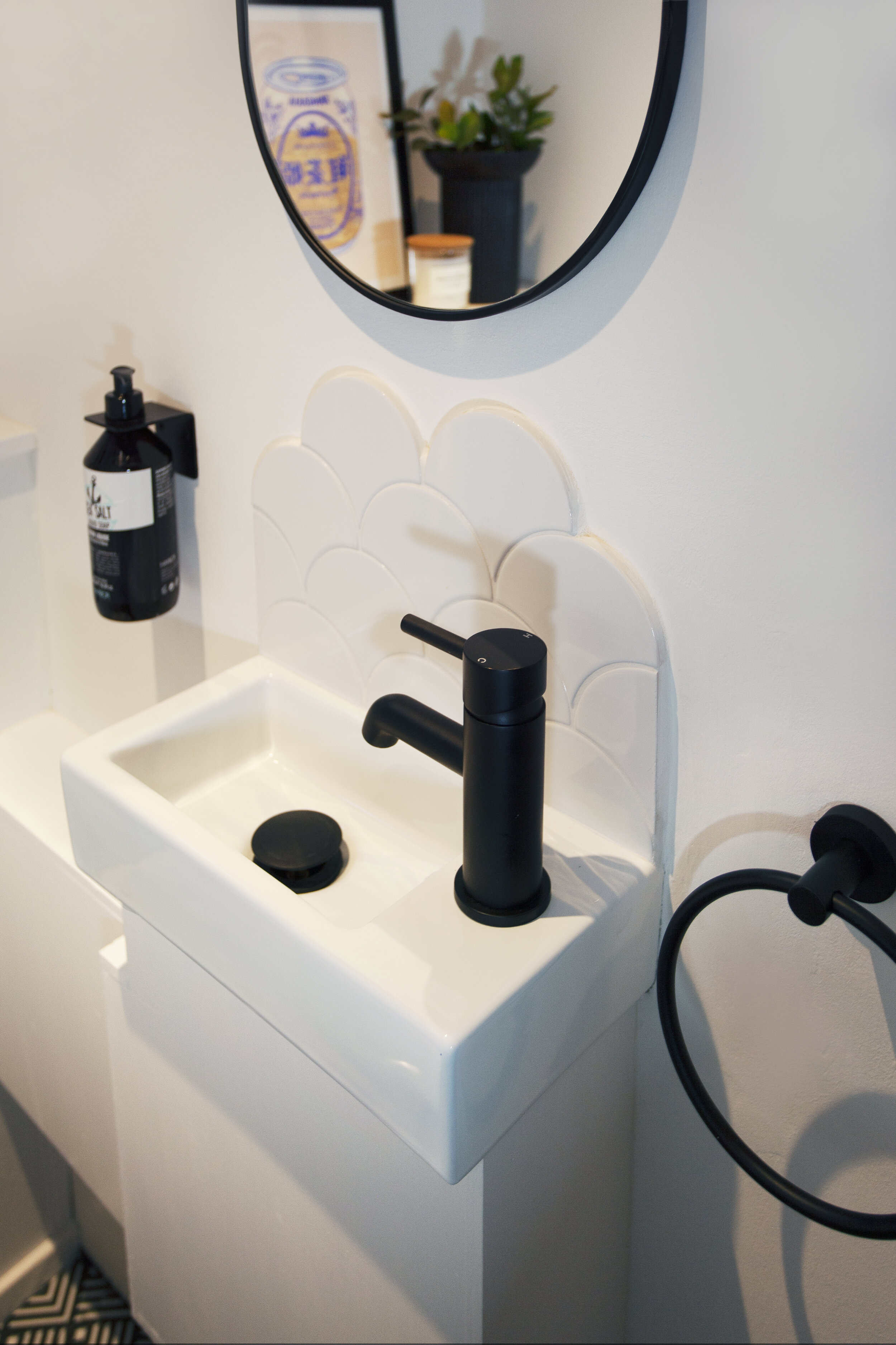
Last but not least is this awesome little bathroom with that Yves Klein blue ceiling and those scalloped tiles. I love the impact she has managed to create in this tiny space using a largely monochrome palette.
It’s now two years since the renovations started and Jenna says she’s definitely not done yet, a feeling I know only too well. “ I wish I could just wave my wand and get it nailed but we all know how it is, it takes time.”
But whatever plans Jenna has up her sleeve, there’s no doubt they have completely transformed what was an awkward, cramped house, into a beautiful light and spacious home. I’ve included a drawing below by MAP Architecture to show you how it all fits together to help you visualise it. Hopefully this provides some inspiration if you’re just about to start, or thinking about renovations. Let me know in the comments below.
Jess x


